I just love this…
A great new way to represent percentage-based statistics instead of the traditional pie chart.
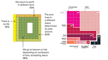
– The chart on the left is from a NY Times story on atheism and the afterlife, and was created by Charles M. Blow.
– On the right, a detail from a Wired story on how much Americans spend on gadgets, and was created by Arno Ghelfi.
Very creative and more representative and accurate I think.
[Via: Anil Dash]